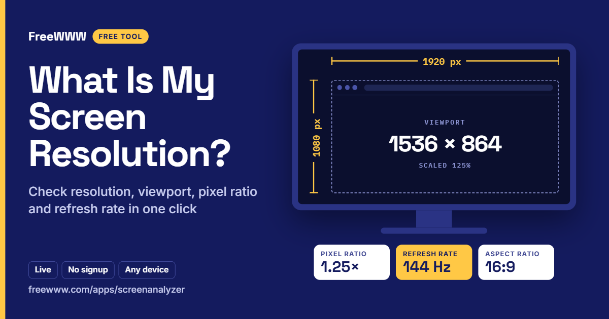
What Is My Screen Resolution? Check It Instantly (Free)
Your screen resolution is the number of pixels your display shows, written as width × height, such as 1920 × 1080. To see yours right now, open the free FreeWWW Screen & Device Analyzer. It detects your resolution, viewport size, pixel ratio and refresh rate the moment the page loads, with no signup.
If the number looks different from what's printed on your monitor box, you're not imagining it. Most modern screens report several different sizes at once. This guide explains each one in plain English, shows you how to check them on any device, and helps you fix the most common display problems.
What's in this guide:
1. Check your screen resolution in one click
2. Why your screen shows three different sizes
3. What every number in the Screen Analyzer means
4. How to check your refresh rate
5. How to check screen resolution on Windows, Mac, iPhone and Android
6. The most common screen resolutions today
7. Common screen problems and quick fixes
8. Frequently asked questions
[IMAGE: The FreeWWW Screen & Device Analyzer showing screen resolution, viewport size, device pixel ratio and refresh rate panels. Alt text: "What is my screen resolution: free live screen and device analyzer showing resolution, viewport and pixel ratio"]
Check Your Screen Resolution in One Click
Open the Screen & Device Analyzer and your results appear instantly. There's nothing to install and no account to create, and the numbers update live as you resize the window or rotate your phone.
1. Open the Screen & Device Analyzer in the browser on the device you want to check.
2. Read Screen Resolution at the top. That's your display size as your system reports it.
3. Look at Viewport Size to see the space your browser actually gives a web page.
4. Check Device Pixel Ratio and Refresh Rate under Device Capabilities.
5. Click Copy Details or Export Data to save the results or send them to IT support or a developer.
To check a second monitor, drag the browser window onto it and click Refresh Data. The tool also keeps a short history in your browser, so you can compare readings from different screens.
Why Your Screen Shows Three Different Sizes
Modern screens have a physical resolution, a scaled resolution and a viewport size, and the three are rarely the same number. Knowing the difference explains almost every "my resolution looks wrong" question.
Physical resolution
This is the real number of pixels in the panel, the figure on the box: 1920 × 1080 (Full HD), 2560 × 1440 (QHD) or 3840 × 2160 (4K). Your operating system's display settings usually show it marked "Recommended".
Scaled resolution and device pixel ratio
On high-density screens, your computer enlarges everything so text isn't tiny. It does this by grouping physical pixels into larger "CSS pixels", the unit websites use. The device pixel ratio (DPR) tells you how many physical pixels make up one CSS pixel. Browsers report the scaled size, which is why a checker may show a smaller number than your box.
Two worked examples:
• A Windows laptop with a 1920 × 1080 screen at 125% scaling reports 1536 × 864 to websites, with a DPR of 1.25. The math: 1920 ÷ 1.25 = 1536, and 1080 ÷ 1.25 = 864.
• An iPhone 15 has a 1179 × 2556 panel with a DPR of 3, so websites see a screen of 393 × 852.
Neither screen is broken. Scaling keeps text readable while the extra pixels make everything sharper. MDN's guide to devicePixelRatio explains how browsers calculate it.
Viewport size
The viewport is the visible area inside your browser window, after tabs, the address bar and scrollbars take their share. It shrinks when you resize the window and changes when you zoom. Web designers build layouts around the viewport, not the screen, so it's the number that matters most when a website looks cramped or cut off.
[IMAGE: Diagram of a laptop screen showing the physical resolution, the scaled resolution and the smaller browser viewport nested inside. Alt text: "Screen resolution vs viewport size vs device pixel ratio explained"]
What Every Number in the Screen Analyzer Means
Each reading answers a specific question about your display, from how sharp it is to whether it supports wide color. Here is what each one tells you.
• Screen Resolution: your display's size in CSS pixels, as the browser sees it.
• Available Space: the screen minus permanent system bars, such as the Windows taskbar or the Mac menu bar.
• Aspect Ratio: the shape of the screen. 16:9 is standard for monitors and TVs, 16:10 is common on laptops, and phones are much taller.
• Orientation: landscape or portrait. It flips when you rotate a phone or tablet.
• Viewport Size and Document Size: the visible page area, and the full length of the page, including the parts you'd scroll to.
• Zoom Level: your browser zoom. Anything other than 100% changes the viewport, so reset it with Ctrl+0 (Cmd+0 on Mac) before testing a website.
• Device Pixel Ratio: physical pixels per CSS pixel. 1 is a standard screen; 2 or 3 is a high-density, "Retina-class" screen.
• Color Depth: bits used per pixel for color. 24-bit (8 bits per channel) is standard on almost every screen.
• Color Gamut: the range of colors the screen can show. sRGB is standard; Display P3 is a wider range used by recent Apple devices and many premium monitors and phones.
• Refresh Rate (est.): how many times per second the screen redraws, in hertz (Hz).
• Touch Support and Max Touch Points: whether the screen accepts touch, and how many fingers it tracks at once.
• Device Type, Display Category and PPI Estimate: a quick classification of your device and an estimate of its pixel density in pixels per inch.
Want to know which web features your browser supports, too? Run the free FreeWWW Browser Capabilities Detector.
How to Check Your Refresh Rate (Is It Really 144Hz?)
The Screen Analyzer estimates your refresh rate by counting how often your browser draws a new frame each second. If it shows 60Hz on a monitor sold as 144Hz, your system is probably not set to use the higher rate.
This is one of the most common surprises for gamers: a new high-refresh monitor often runs at 60Hz until you change a setting. The usual causes:
• Windows is set to 60Hz. Go to Settings → System → Display → Advanced display and pick the highest rate under "Choose a refresh rate". Microsoft's guide on changing your monitor's refresh rate walks you through it.
• The cable or port can't carry it. An older HDMI cable or port may cap you at 60Hz. DisplayPort, or a newer HDMI cable and port, usually fixes it.
• Battery saver is on. Many laptops drop to 60Hz on battery power to save energy.
• The browser is throttling. A background tab or power-saving mode can lower the browser's frame rate, so keep the tab in front while you test.
Because a browser measures frames rather than reading the hardware directly, treat the reading as a reliable estimate, not a lab measurement. If it matches your monitor's spec, you're set.
How to Check Screen Resolution on Windows, Mac, iPhone and Android
Every system shows its resolution in display settings, but the path is different on each. Use these steps when you want your physical resolution rather than the browser's view.
Windows 11
1. Right-click the desktop and choose Display settings.
2. Under "Scale & layout", look at Display resolution. The option marked "Recommended" is your screen's physical resolution.
3. Check Scale in the same section to see how much Windows enlarges things. Microsoft explains each option in Change your screen resolution and layout in Windows.
Mac
1. Open the Apple menu → System Settings → Displays.
2. On built-in Retina displays, options run from "Larger Text" to "More Space". These are scaled sizes, not the panel's pixel count. Apple covers the details in Change your Mac display's resolution.
iPhone and iPad
iOS has no resolution setting. Open the Screen Analyzer in Safari to see your viewport and pixel ratio, or look up your model's display specs on Apple's website.
Android
1. Open Settings → Display.
2. On many phones, including Samsung Galaxy models, tap Screen resolution to see or change it. If your phone has no such option, use the Screen Analyzer instead.
The Most Common Screen Resolutions Today
1920 × 1080 (Full HD) is still the most common desktop resolution, and 360 × 800 is the most common mobile viewport worldwide, according to BrowserStack's 2026 analysis.
Desktop and laptop
• 1920 × 1080 (1080p, Full HD): the standard for most office monitors and budget laptops.
• 1366 × 768: older and entry-level laptops.
• 1440 × 900 and 1536 × 864: usually scaled laptop screens rather than physical panels.
• 2560 × 1440 (1440p, QHD): popular for gaming and creative monitors.
• 3840 × 2160 (4K, UHD): high-end monitors and TVs, almost always run with scaling.
Phones and tablets (viewport sizes)
• 360 × 800: many Android phones.
• 390 × 844 and 393 × 852: recent iPhones.
• 768 × 1024: iPads in portrait.
If you design websites, test at these sizes and at your own, then use the Copy Details button to log exact device specs in your bug reports. Need to show a developer exactly what you see? Capture it with the free FreeWWW Screenshot Tool.
Common Screen Problems and Quick Fixes
Most screen complaints come from scaling, zoom or a wrong setting rather than a faulty display. Check these first before you blame the hardware.
• Everything looks blurry. Your display isn't running at its native resolution. Choose the "Recommended" option in display settings.
• Text is too small on a 4K screen. Raise the scale to 150% or more instead of lowering the resolution. You keep the sharpness and get bigger text.
• A website looks cramped or cut off. Reset browser zoom with Ctrl+0 (Cmd+0 on Mac), then check your viewport size in the Analyzer.
• Your monitor feels choppy. The refresh rate is probably stuck at 60Hz. Follow the refresh rate steps above.
• Colors look dull on a wide-gamut screen. Check the Color Gamut reading. If it shows sRGB on a display sold as P3-capable, review your system's color profile.
• Your second monitor shows a different resolution. Each monitor has its own resolution and scale. Drag the browser to each one and click Refresh Data to compare.
Frequently Asked Questions
What is my screen resolution?
Your screen resolution is your display's width × height in pixels, such as 1920 × 1080. Open the free FreeWWW Screen & Device Analyzer to see it instantly, along with your viewport size, pixel ratio and refresh rate.
Why does my screen resolution look smaller than my monitor's?
Your system is scaling the display so text stays readable. A 1920 × 1080 laptop at 125% scaling reports 1536 × 864 to websites. Your physical resolution hasn't changed.
What is the difference between screen resolution and viewport size?
Screen resolution is the size of your whole display. Viewport size is the smaller area inside the browser where a web page appears, after tabs, toolbars and scrollbars.
What does a device pixel ratio of 2 mean?
It means each CSS pixel is drawn with 2 × 2 physical pixels, so images and text look twice as sharp as on a standard screen. Phones are usually 2 or 3, and many standard monitors are 1.
How do I know if my monitor is running at 144Hz?
Open the Screen Analyzer and check the Refresh Rate reading. If it shows 60Hz, raise the rate in Windows under Settings → System → Display → Advanced display, and make sure your cable supports it.
What is the best screen resolution?
The best resolution is your display's native one, marked "Recommended" in your settings. To make things bigger, use scaling rather than a lower resolution.
Know Your Screen in Seconds
Knowing your screen resolution, viewport and refresh rate helps you fix blurry text, set up a new monitor correctly and build websites that work on every device. Bookmark the free FreeWWW Screen & Device Analyzer to check any screen in one click, with no signup.